When people say a cartoon is “aesthetic,” I usually know what they mean before they explain it. It’s that feeling where you pause an episode and the frame looks like it belongs on a poster. The colors feel intentional. The lighting feels emotional. The character designs feel like they were built to be remembered.
This post is my deep dive into aesthetic cartoons and characters—not just “pretty shows,” but cartoons whose visual language is doing real storytelling. I’m talking color palettes, shadows, shape language, backgrounds, and the little production tricks that quietly make a world feel alive.
And if you’re the kind of person who loves connecting the dots, you’ll notice how aesthetics shift by era and network—especially when you compare the moodier mystery vibe of Disney Channel cartoons with the bold experimental streak that came out of Cartoon Network’s best kids shows.
Aesthetic Cartoons & Characters
Are you tired of cartoons that feel visually “default”? I get it. Sometimes the plot is fine, but the look is flat—same lighting, same backgrounds, same character silhouettes. Aesthetic cartoons feel different because the creators are making visual decisions that shape your emotions before a character even speaks.
My checklist: what makes a cartoon feel “aesthetic”
- Color palette: limited, consistent, and mood-driven (not random).
- Lighting choices: bright-and-cozy vs shadowy-and-noir changes the whole vibe.
- Shape language: sharp = danger, rounded = comfort, angular = tension.
- Background design: the world looks lived-in (or intentionally minimalist).
- Silhouettes: you can recognize the character from a single outline.
- Texture: grain, brushy backgrounds, or flat vector style—anything intentional.
Standout Aesthetic Cartoons (And Why Their Style Works)
Gravity Falls (Disney Channel)
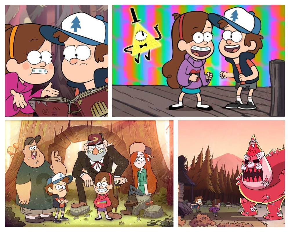
Gravity Falls is one of those shows where the background art does half the storytelling. When I watch it, I can feel the damp woods, the dusty tourist-trap vibe, and the “something is hiding behind the trees” tension. Alex Hirsch built the series around mystery and summer nostalgia, and the aesthetic supports that mood constantly.
Aesthetic Type: Mystery woods / cozy-creepy
Color + lighting: warm daylight for nostalgia, cool shadows for unease
Design signature: detailed forests, strange symbols, “tourist town” clutter
My Take: The show looks like a summer postcard that slowly turns into a conspiracy board.
The cast design plays into that readability too—if you’ve ever browsed the full Gravity Falls characters list, you can see how distinct silhouettes are part of the show’s identity. And the aesthetic hits even harder once you’re watching it through the eyes of Dipper Pines, Mabel, and even a “too-cool-for-this-town” presence like Wendy Corduroy.
Steven Universe
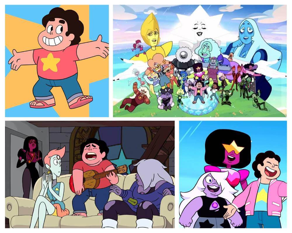
To me, Steven Universe is “soft aesthetic” done with real discipline. The palette leans warm and dreamy, the linework is approachable, and the world feels emotionally color-coded. Rebecca Sugar’s style makes heavy themes feel accessible without stripping the story of weight.
Aesthetic Type: Pastel fantasy / emotional color coding
Color + lighting: warm gradients, sunset tones, gentle contrast
Design signature: simple shapes + iconic silhouettes + “soft but powerful” staging
My Take: It looks comforting on purpose, which makes the emotional punches land harder.
It’s also hard to separate the show’s aesthetic from its cultural impact—especially when people talk about modern representation in animation. That broader conversation connects naturally with gay animated cartoons because Steven Universe helped normalize the idea that “kids animation” can still be emotionally sophisticated.
Rick and Morty
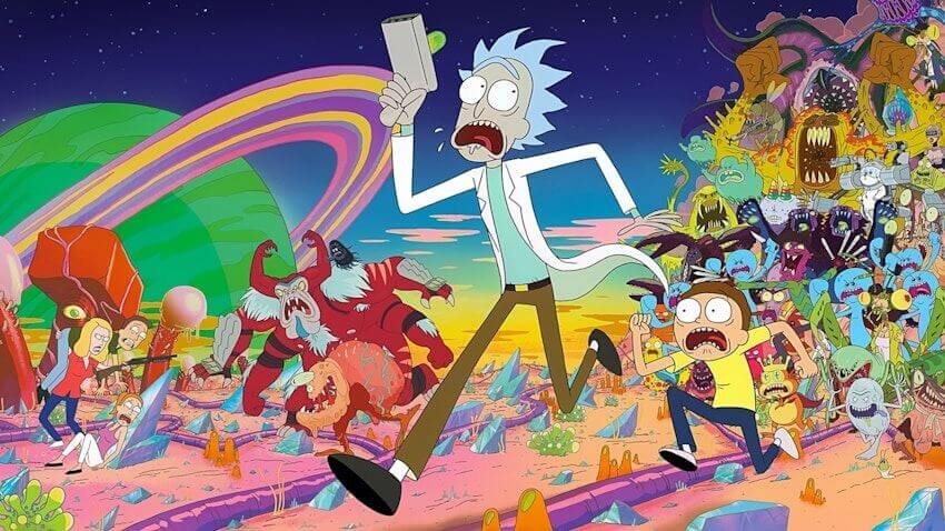
I don’t call Rick and Morty “cute aesthetic,” but I do think it’s visually distinctive. The character designs are intentionally a little awkward, the aliens range from silly to gross, and the show leans into the idea that the universe is infinite—and most of it is not friendly.
Aesthetic Type: Sci-fi chaos / grotesque comedy
Color + lighting: neon sci-fi pops against “normal suburban” dullness
Design signature: odd anatomy, surreal props, background gags everywhere
My Take: The aesthetic says “nothing is sacred,” and the art commits to it.
It fits neatly into the adult animation lane—if you’re already in that world, the next click that usually makes sense is browsing adult cartoons similar to Family Guy, because the “fast jokes + dark turns” rhythm is part of the same ecosystem.
Samurai Jack
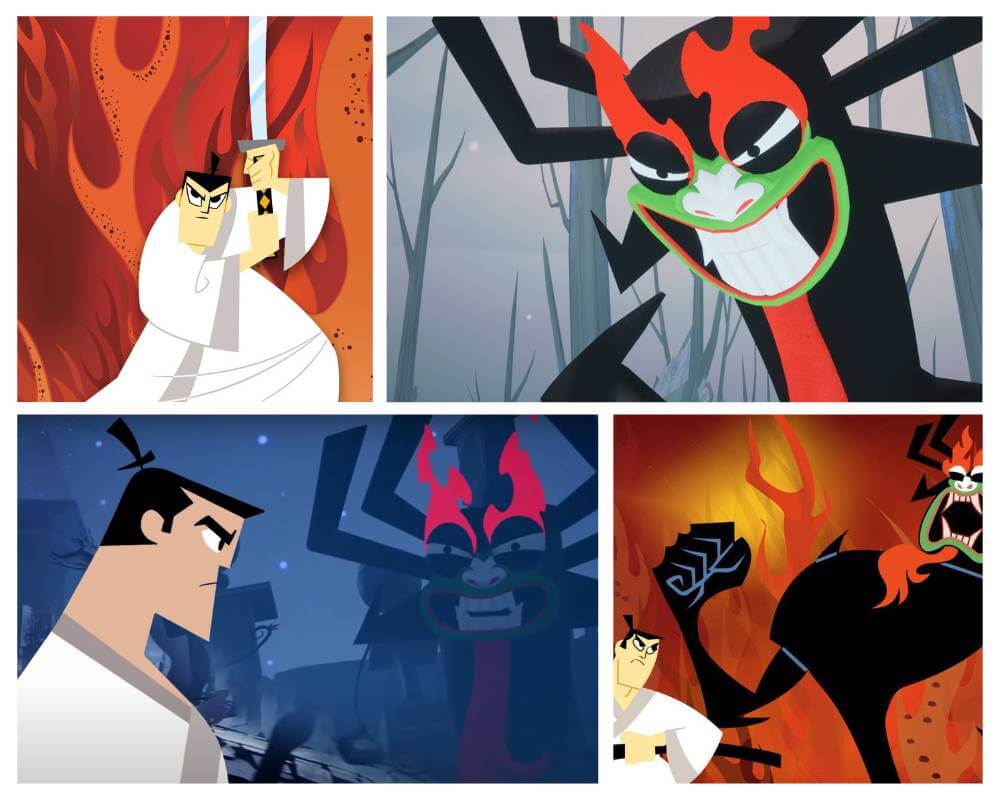
Samurai Jack is one of my favorite examples of minimalist aesthetic with maximum impact. Genndy Tartakovsky’s direction leans cinematic—wide shots, bold silhouettes, and long stretches where the visuals carry the emotion without needing dialogue.
Aesthetic Type: Minimalist cinema / graphic design action
Color + lighting: bold blocks of color, high-contrast staging
Design signature: negative space, crisp silhouettes, “one perfect frame” composition
My Take: The show looks like a moving art poster—especially during quiet moments.
Whenever I’m thinking about why action animation looks “clean” versus “noisy,” I end up comparing shows like this with broader genre breakdowns—especially anything that leans on choreography, like cartoon martial arts.
The Boondocks

The Boondocks is aesthetic in a different way—it uses a sharper, anime-influenced look to support satire that hits hard. The character designs are expressive, the linework is crisp, and the show’s visual style helps the jokes land faster (and harsher) than a softer, rounder cartoon might allow.
Aesthetic Type: Anime-influenced satire
Color + lighting: grounded suburb realism with heightened facial expressions
Design signature: sharp eyes, expressive mouths, “anime intensity” in an American setting
My Take: The style makes the satire feel sharper—like the art is part of the punchline.
It’s hard not to think of the Freeman brothers when talking about the show’s visual identity, which is why character pages like Huey Freeman and Riley Freeman are useful anchors for the aesthetic conversation. And if you like spotting anime influence in western animation, that same crossover shows up across the broader trend of cartoons inspired by anime.
Batman: The Animated Series

If someone asked me for the cleanest example of “noir cartoon aesthetic,” I’d point to Batman: The Animated Series instantly. The show’s look—often described as “Dark Deco”—combines noir shadows with Art Deco shapes, creating Gotham as a place that feels timeless and haunted.
Aesthetic Type: Noir / Art Deco (“Dark Deco”)
Color + lighting: heavy shadows, silhouettes, and high contrast
Design signature: angular skylines, vintage-futurist Gotham, dramatic framing
My Take: This is the show that proves a cartoon can look “grown” without losing animation style.
If you like that gothic-meets-stylized vibe, it connects naturally to visual rabbit holes like scary Batman art and broader DC animation browsing through DC animated movies. And when I’m thinking “noir composition,” I also end up revisiting old visual references like black and white comics because contrast is doing most of the heavy lifting.
Adventure Time
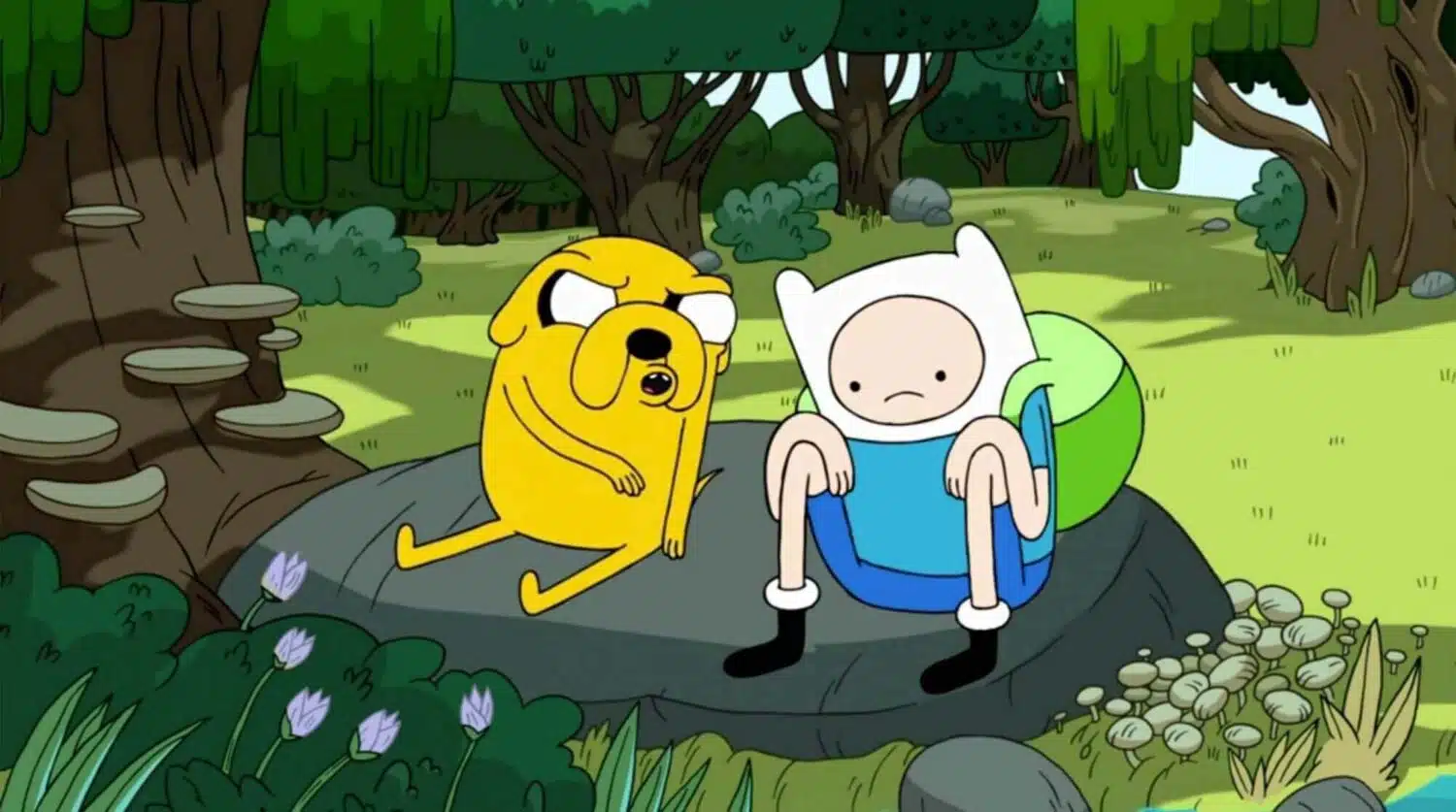
Adventure Time is the kind of show that tricks you with cuteness, then hits you with surreal beauty. The linework is simple and playful, but the world design can be wildly imaginative—bright candy landscapes one minute, eerie existential spaces the next. That contrast is part of its aesthetic identity.
Aesthetic Type: Cute-surreal fantasy
Color + lighting: bright palette with sudden dark tonal shifts
Design signature: simple characters in wildly creative environments
My Take: It’s like the show is smiling while it quietly breaks your brain.
And when a show leans into mystical forests, curses, or eerie whimsy, my brain always connects it to the broader “magic world” aesthetic you also get in cartoons about witches.
Bonus Cozy Aesthetic: Hilda

Not all aesthetic cartoons are dark or surreal. Sometimes I want “cozy visual therapy,” and that’s where Hilda-style storytelling shines: soft colors, clean shapes, and environments that feel safe—even when the plot introduces folklore creatures.
Aesthetic Type: Cozy folklore
Color + lighting: warm, gentle tones with low visual aggression
Design signature: simple, readable shapes + inviting backgrounds
My Take: It’s the kind of aesthetic that makes me want to live in the world, not just watch it.
That’s why it’s easy to slide from the show into related reading like Hilda’s Netflix run and character-centered pages like Frida, because the design is part of the comfort.
What Is Rubber Hose Animation Style?
Rubber hose animation is one of those terms that sounds funny until you realize it describes a whole era. It’s an early animation style where arms and legs look like flexible hoses—no joints, no elbows—just smooth curves and exaggerated motion. It dominated a lot of early American cartoons and helped animators create lively movement with the tools they had at the time.
Why rubber hose still matters to cartoon aesthetics
- It’s a visual language: instantly recognizable “early cartoon” motion.
- It shaped character design: simplicity made animation faster and more expressive.
- It’s part of the timeline: you can trace modern styles back to these foundations.
Whenever I’m thinking about the roots of animation style, I end up going back to early history pieces like the first cartoon ever and the broader context of silent-era cartoons, because you can literally see the aesthetic rules being invented in real time.
Aesthetic Cartoons: The Animated Art of Style and Grace
Aesthetic cartoons have always existed, but the way we talk about them changed when social media made screenshots and “vibe clips” a form of fandom. Now people don’t just love a show—they love its palette, its framing, its mood. If you’ve ever tried recreating a cartoon’s look, you already know the obsession can turn into an art project, which is why I also see a natural overlap with practical creative posts like cartoon painting ideas.
And behind the scenes, aesthetics are shaped by tools and teams—studios, pipelines, and production constraints. If you like the “how it’s made” side of animation, it’s worth browsing top animation studios and comparing western workflows to the systems discussed in Japanese anime studios.
Aesthetic Cartoons
- What makes a cartoon “aesthetic”? Intentional choices: palette, lighting, silhouettes, and background design that reinforce the story’s mood.
- What’s the best dark/noir aesthetic cartoon? Batman: The Animated Series is a top example because of its “Dark Deco” look.
- What’s the best cozy aesthetic cartoon vibe? Shows like Hilda lean into soft palettes and inviting environments.
- What’s the most minimalist aesthetic cartoon? Samurai Jack is famous for using negative space and bold composition to create impact.