
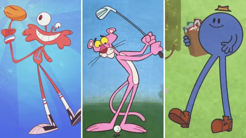
In animation, a skinny body is rarely just a body type.
A long neck can make a character look nervous before they speak. Thin limbs can turn a stumble into a full-screen event. A narrow silhouette can suggest elegance, frailty, speed, hunger, awkwardness, or something genuinely supernatural.
I have ranked them by three things:
- Silhouette: Can you recognize the character from the outline alone?
- Movement: Does the lanky frame change how the character walks, runs, fights, or falls?
- Design necessity: Would the personality still read as clearly with ordinary proportions?
Why Animators Draw Tall and Skinny Characters
Strong character design depends on visual communication.
Animation Mentor’s character-design overview emphasizes proportion, shape, contrast, and visual language, while Pixar’s discussion of stylization and memorable silhouettes explains why a character’s outline can carry storytelling information before facial details are visible.
Tall and skinny designs are especially useful because they create four immediate advantages:
- Clear silhouettes: Long limbs, narrow torsos, and unusual head-to-body ratios remain readable even at a distance.
- Comic movement: A lanky figure has more visual distance to fold, stretch, whip, wobble, and collapse.
- Fast personality shorthand: Thin can read as nervous, elegant, hungry, strange, fragile, sneaky, or highly energetic.
- Built-in contrast: Putting a tall beanpole beside a short or round character makes both designs look stronger.
How to read each Design Audit
- Visual signature: The feature that makes the silhouette recognizable.
- Animation secret: How the proportions improve movement or posing.
- Why it matters: What the design tells us about the personality.
25 Skinny Cartoon Characters, Ranked by Design
Spaghetti Man (The Super Globetrotters)
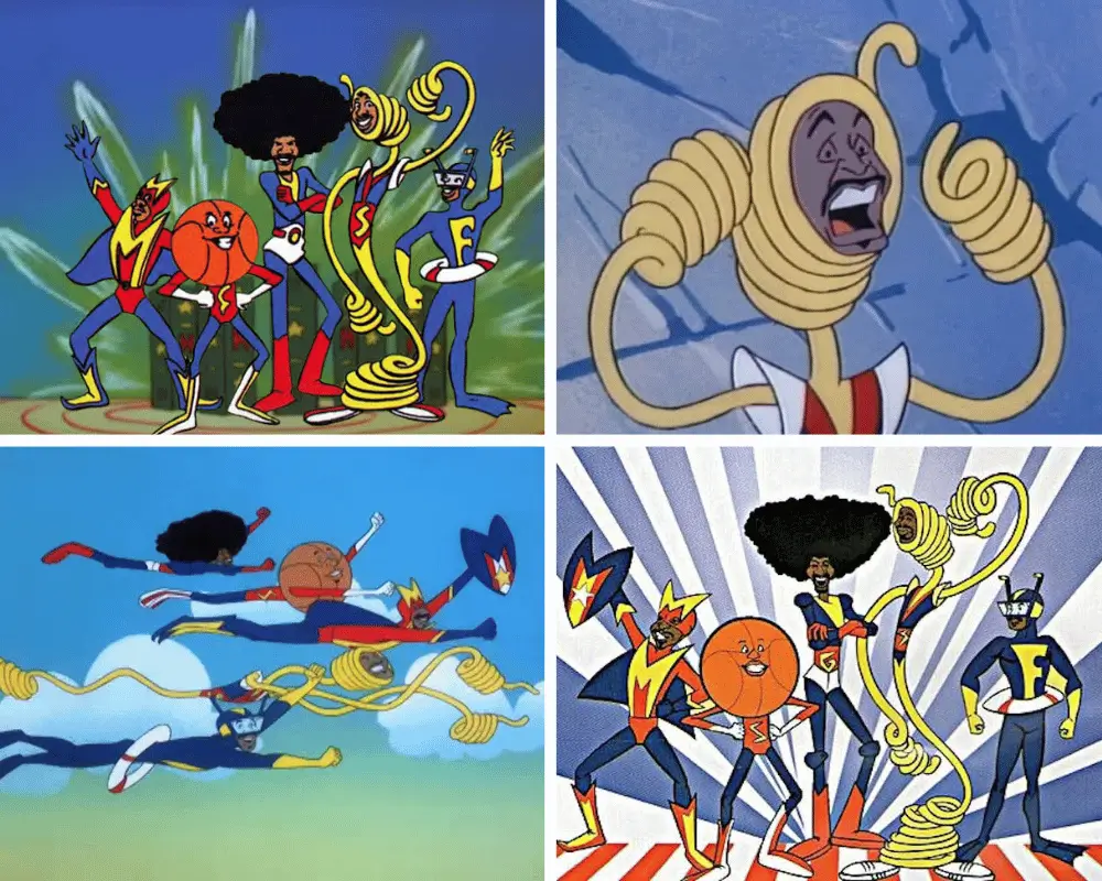
Archetype: The Literal Noodle
Spaghetti Man is the deepest cut on the list, but he may be the most literal example.
The character was the superhero identity of Harlem Globetrotter James “Twiggy” Sanders in Hanna-Barbera’s 1979 series The Super Globetrotters. His body could stretch into ropes, ladders, nets, and other useful shapes.
That makes thinness more than a visual trait. It is the entire power.
The show came from Hanna-Barbera during an era of tightly controlled television-animation budgets. A hero made from clean, flexible lines was easy to pose clearly and perfect for fast visual gags.
- Visual signature: A body that looks like living string.
- Animation secret: The limbs can become props without a complicated transformation.
- Why it matters: With normal proportions, Spaghetti Man would lose both his name and his superpower.
Rolf (Ed, Edd n Eddy)
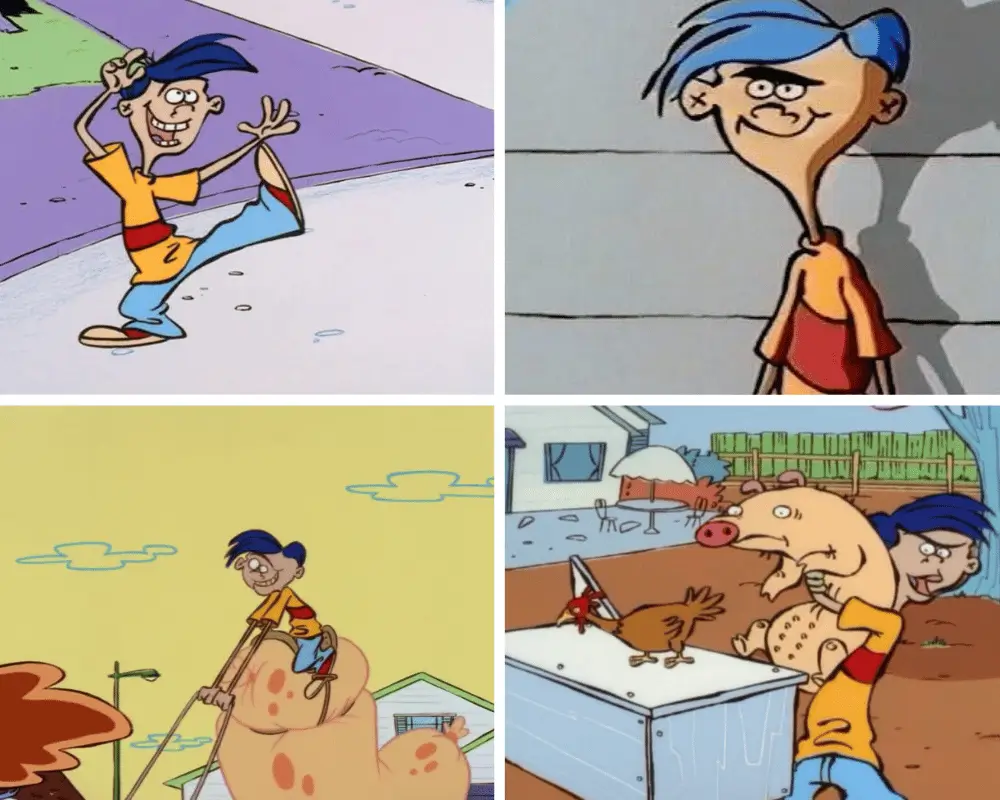
Archetype: The Slapstick Farmhand
Rolf’s long torso and loose limbs make every reaction feel a little too large for the cul-de-sac.
He does not merely become angry. He throws his whole frame into a strange Old Country challenge, proverb, or punishment. His gestures travel farther than those of the more compact children around him, which makes his sudden mood changes land harder.
I would not rank Rolf among animation’s most famous skinny designs, but his body is doing real comic work. The character always looks one second away from charging into a ritual nobody else understands.
- Visual signature: Tall hair, narrow torso, and long swinging arms.
- Animation secret: His limbs extend already exaggerated poses even further.
- Why it matters: The stretched frame makes Rolf’s traditions feel physically bigger than everyone else’s reality.
Edd “Double D” (Ed, Edd n Eddy)
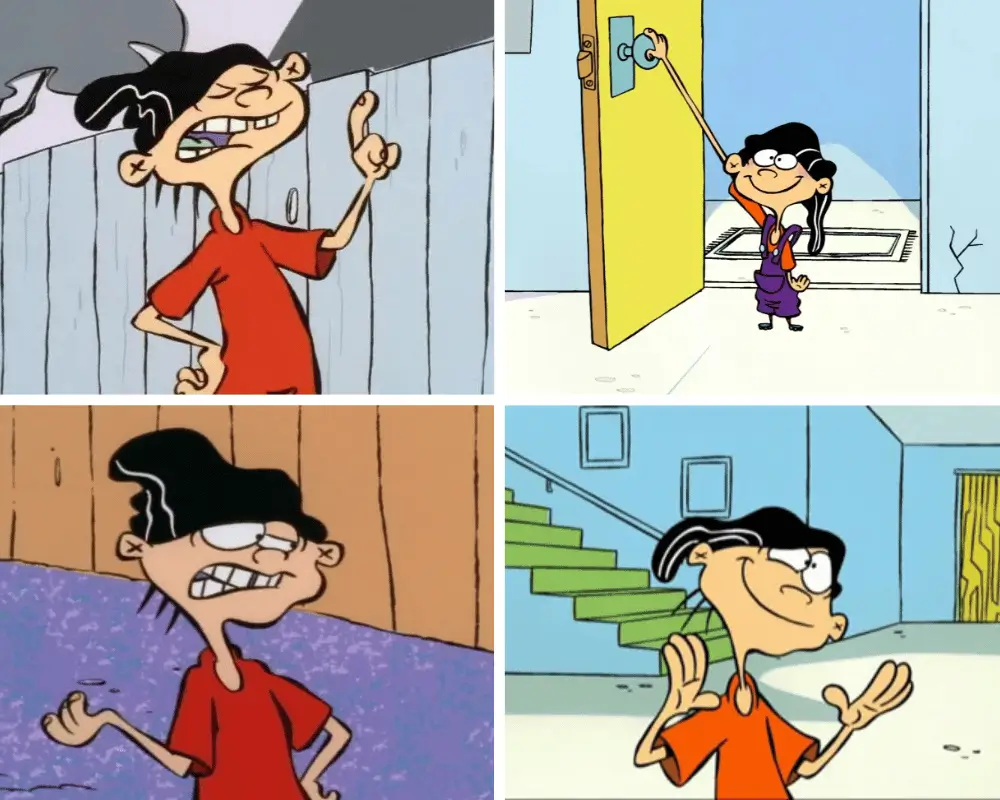
Archetype: The Cautious Pencil Line
Edd is built like someone who would rather not touch anything sticky.
His narrow shoulders, thin neck, and permanently controlled posture visually separate him from Ed’s heavy mass and Eddy’s compact schemer shape. The three Eds are a great example of body contrast doing half the characterization before the dialogue begins.
Double D rarely throws himself into movement willingly. He recoils, tiptoes, and holds his arms close as though the entire neighborhood is a contamination risk.
- Visual signature: A thin vertical frame topped by the mysterious black hat.
- Animation secret: Small, precise gestures contrast with the show’s violent line boil and chaos.
- Why it matters: His careful body language sells intelligence, anxiety, and physical caution at once.
Stolas (Helluva Boss)
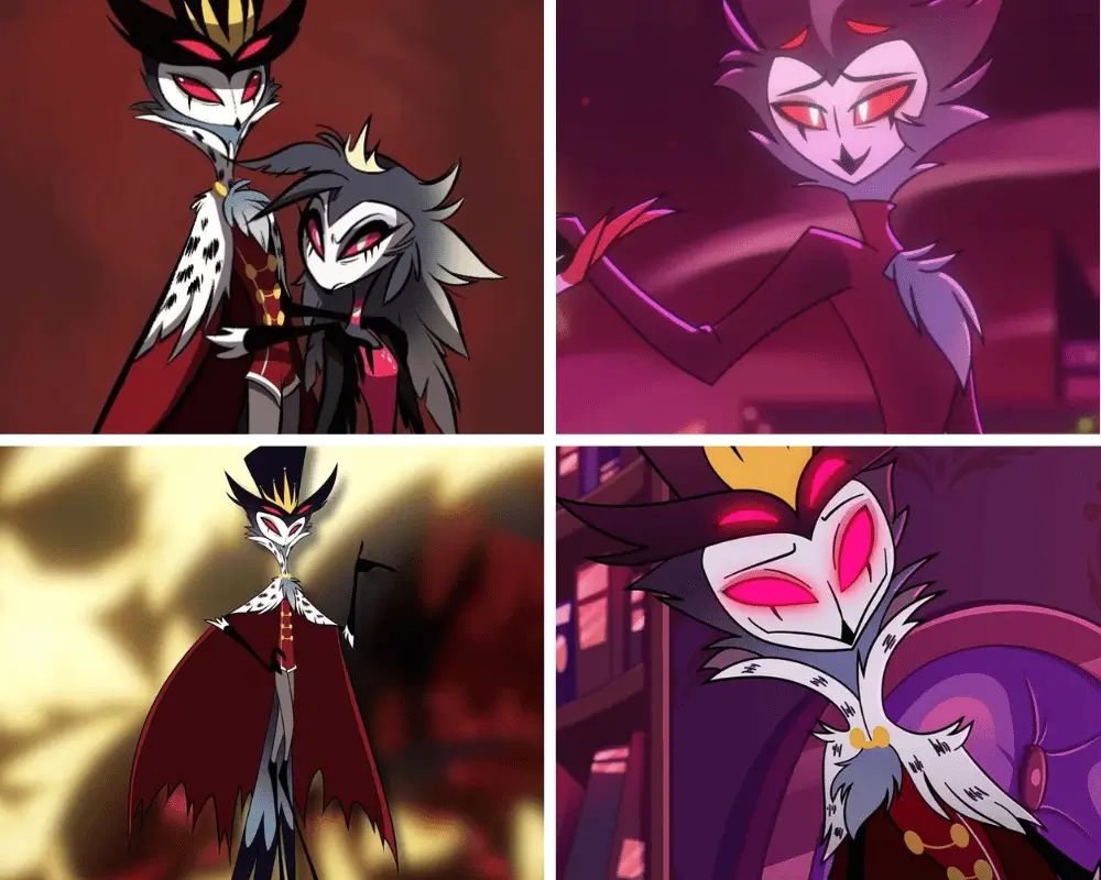
Archetype: The Aristocratic String-Bean
Stolas is one of the newer characters people immediately mention when the subject turns to tall, skinny animated figures.
His design stretches an owl into a towering royal silhouette: narrow waist, long neck, sweeping cape, thin legs, and multiple glowing eyes. The proportions make him look elegant and imposing, but also emotionally exposed.
That tension is what works for me. Stolas can fill a doorway like a supernatural ruler and then fold inward like an embarrassed romantic seconds later.
- Visual signature: A narrow owl silhouette extended by a crown, cape, and extremely long legs.
- Animation secret: His height allows poses to shift from regal vertical lines to dramatic collapses.
- Why it matters: The body captures the contradiction between royal status and emotional vulnerability.
Beavis and Butt-Head
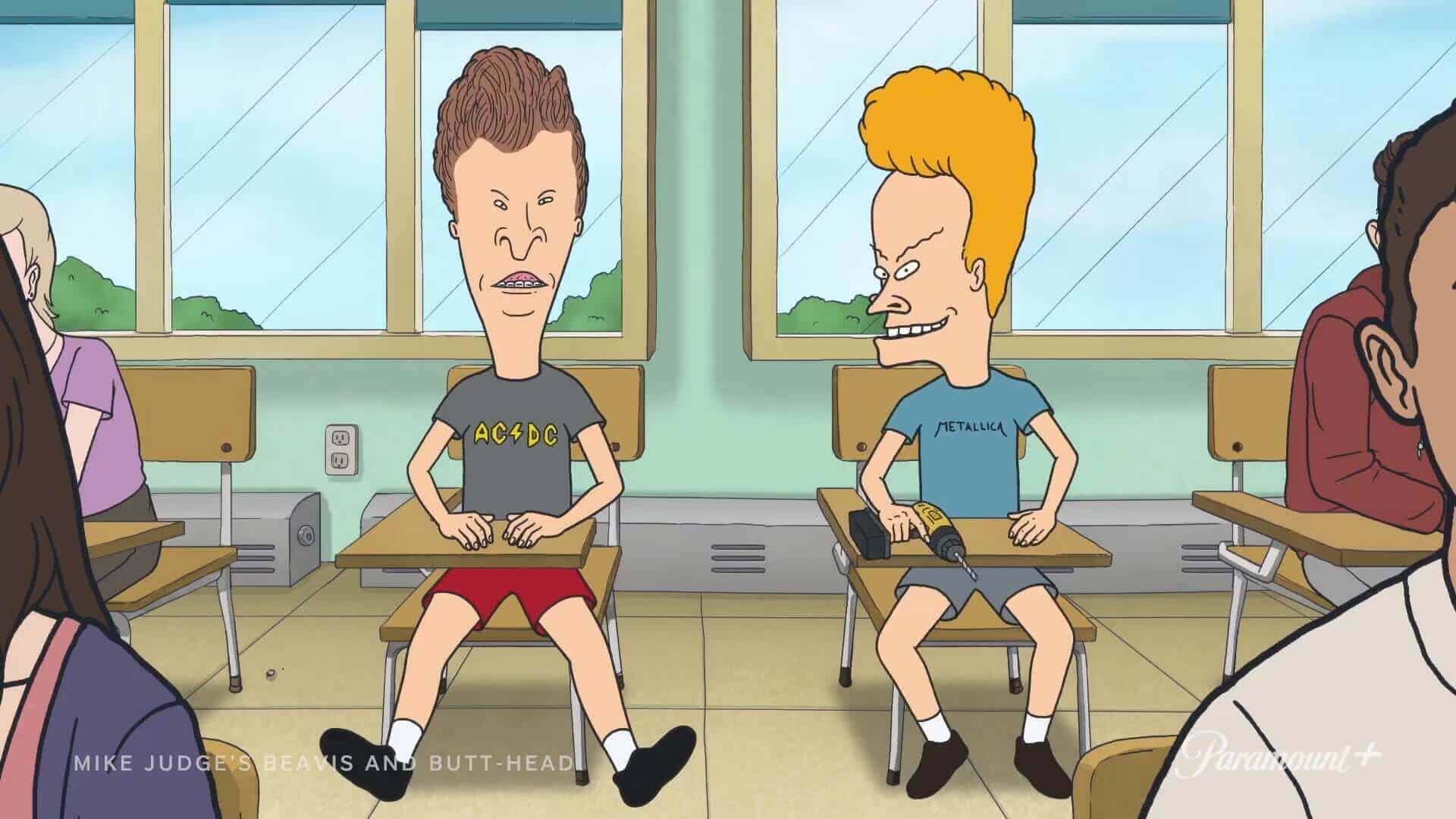
Archetype: The Scrawny Slackers
Beavis and Butt-Head look as though posture has completely given up on them.
Their shoulders roll forward, their arms dangle, and their narrow bodies seem permanently folded toward a television screen. They are not designed to look athletic, heroic, or even comfortable.
The thin frames help sell neglect and adolescent awkwardness without requiring a speech about either one. They look unfinished because, emotionally and socially, they are unfinished.
- Visual signature: Long faces attached to loose, forward-slumped bodies.
- Animation secret: Their limited movement makes every sudden head-bob or laugh more noticeable.
- Why it matters: The scrawny posture turns apathy into a silhouette.
Leni Loud (The Loud House)
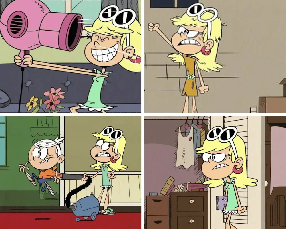
Archetype: The Airy Fashion Silhouette
Leni’s design is light, open, and uncluttered.
Her long legs, slim torso, large sunglasses, and simple green dress create a fashion-doll outline that reads immediately in the Loud family’s crowded group shots. The design does not need an unverified real-world fashion inspiration to make sense; it works on its own terms.
Her relaxed arms and soft posture also fit her sweet, absent-minded personality. She rarely looks physically tense, even when the household around her is exploding.
- Visual signature: Long legs, large sunglasses, and a clean dress shape.
- Animation secret: Her loose posture gives her a breezier rhythm than her more frantic siblings.
- Why it matters: The design makes Leni feel lighthearted without reducing her to a single joke.
For more fashion and visual shorthand from that period, see my guide to 1960s cartoons.
Judy Jetson (The Jetsons)
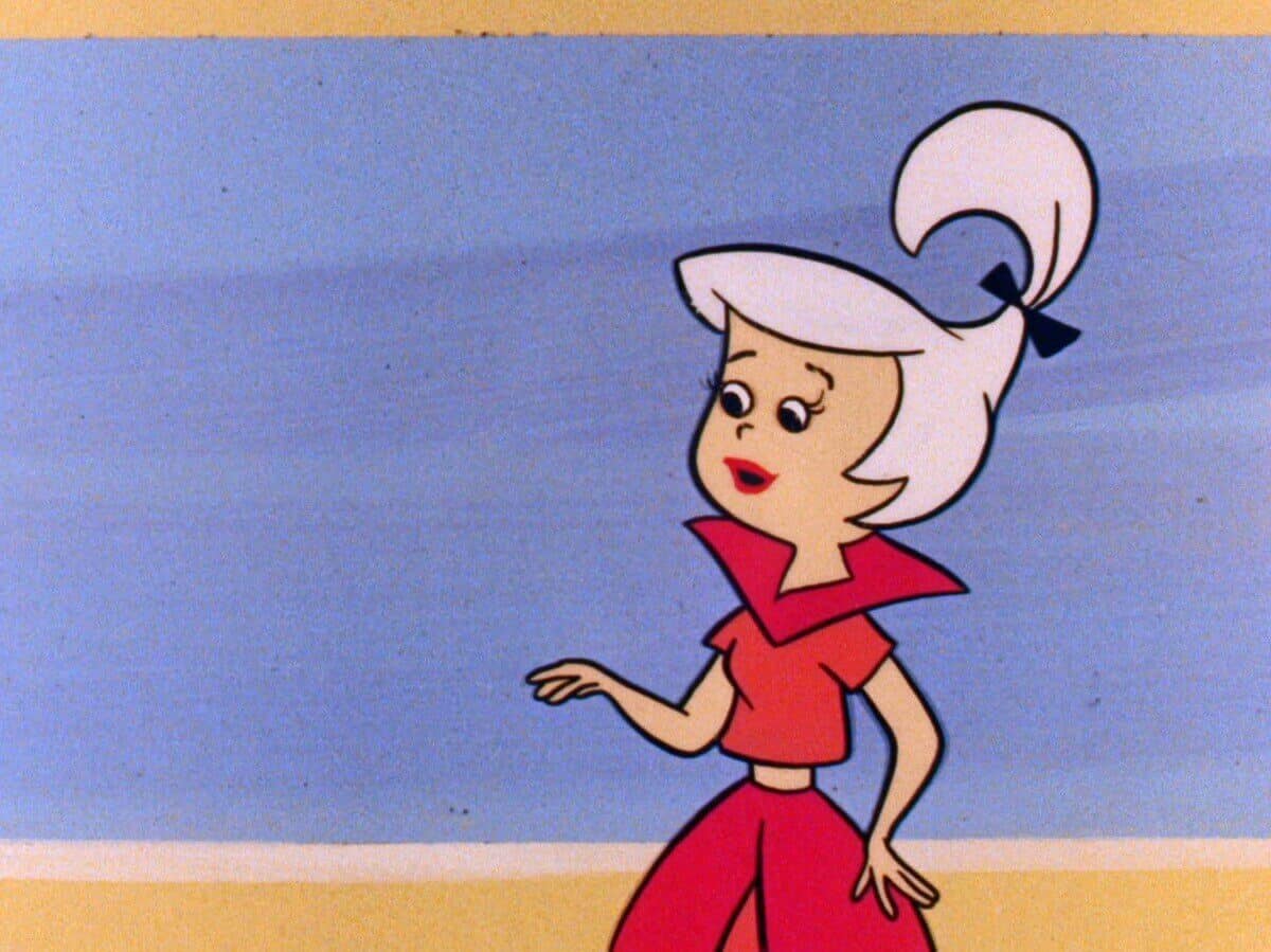
Archetype: The Retro-Future Fashion Line
Judy Jetson’s design is basically a 1960s idea of future teenage glamour drawn as a single vertical line.
Her long legs and narrow waist keep the silhouette elegant, while the high ponytail and pointed collar stop it from becoming generic. In a show built from clean mid-century shapes, she looks like a fashion illustration that learned how to walk.
The thinness is not used for slapstick as often as it is with Goofy or Shaggy. It is used to signal modernity, youth, and style.
- Visual signature: Long legs balanced by a high ponytail and flared collar.
- Animation secret: The simple body keeps her readable against the show’s busy futuristic backgrounds.
- Why it matters: Judy’s proportions help sell the Jetsons’ vision of sleek, effortless modern life.
Ferb Fletcher (Phineas and Ferb)
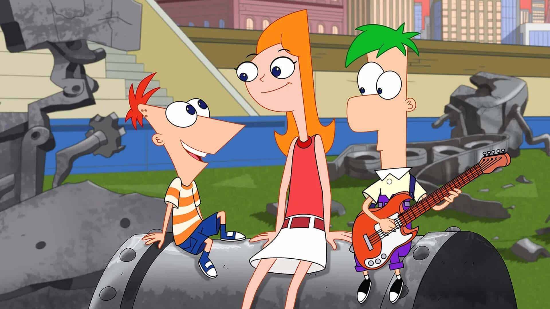
Archetype: The Geometric Beanpole
Ferb is less a conventional body than a stack of rectangles.
His extremely narrow frame keeps attention on the tall rectangular head, while his straight posture and minimal expression make him the visual opposite of Phineas’s triangular energy.
That contrast is the point. Phineas leans forward and generates ideas; Ferb stands upright and quietly makes them possible.
I explored the character more fully in my Ferb Fletcher profile.
- Visual signature: A tall rectangle balanced on two very thin legs.
- Animation secret: Tiny changes in posture or facial expression become funnier because he moves so little.
- Why it matters: The rigid, vertical design communicates calm competence beside Phineas’s restless triangle.
Mr. Crocker (The Fairly OddParents)
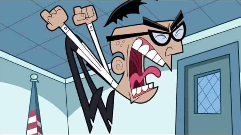
Archetype: The Conspiracy Pretzel
Mr. Crocker looks like anxiety bent a man into the wrong shape.
His ears sit on his neck, his shoulders fold forward, and his thin limbs fire outward whenever his fairy obsession takes control. The design is intentionally unstable. Even when standing still, he seems to be vibrating toward another breakdown.
A wider or more grounded character would not make those eruptions nearly as funny. Crocker has to look as though his own theory might physically snap him in half.
- Visual signature: A sharp hunch, misplaced ears, and limbs pointing in different directions.
- Animation secret: The thin body can jackknife into extreme poses during his outbursts.
- Why it matters: His obsession is visible even with the sound turned off.
Mandark (Dexter’s Laboratory)
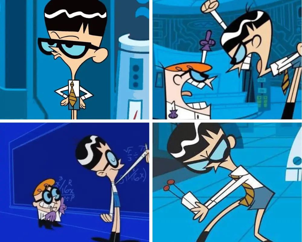
Archetype: The Rival Built From Opposites
Mandark works because he is everything Dexter is not.
Dexter is short, compact, round-headed, and visually grounded. Mandark is tall, narrow, sharp-haired, and slightly collapsed. Put the two silhouettes beside each other and the rivalry explains itself.
This is one of the cleanest examples of contrast in television character design. Mandark’s thinness is not just about looking nerdy; it makes Dexter look even denser and more stubborn.
- Visual signature: Beanpole body, large glasses, and a pointed helmet of hair.
- Animation secret: His long frame gives jealous bows, laughs, and collapses a theatrical sweep.
- Why it matters: The design turns the Dexter–Mandark conflict into a battle of shapes.
Rick Sanchez (Rick and Morty)
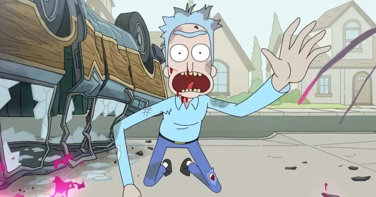
Archetype: The Brittle Mad Scientist
Rick looks physically breakable, which makes his control over entire realities more unsettling.
His narrow torso, bent neck, spindly legs, lab coat, and explosive blue hair create a silhouette that feels chemically unstable. He is usually slouched, rarely balanced, and often moving as though his brain arrived before the rest of his body.
That visual frailty also prevents him from looking like a conventional action hero. Rick survives through intelligence, technology, selfishness, and luck, not because the design promises physical strength.
- Visual signature: A bent white coat beneath jagged blue hair.
- Animation secret: His uneven posture makes intoxication, panic, and sudden menace readable immediately.
- Why it matters: The weak-looking body makes his intellectual power feel more dangerous.
Mr. Tall (Mr. Men)
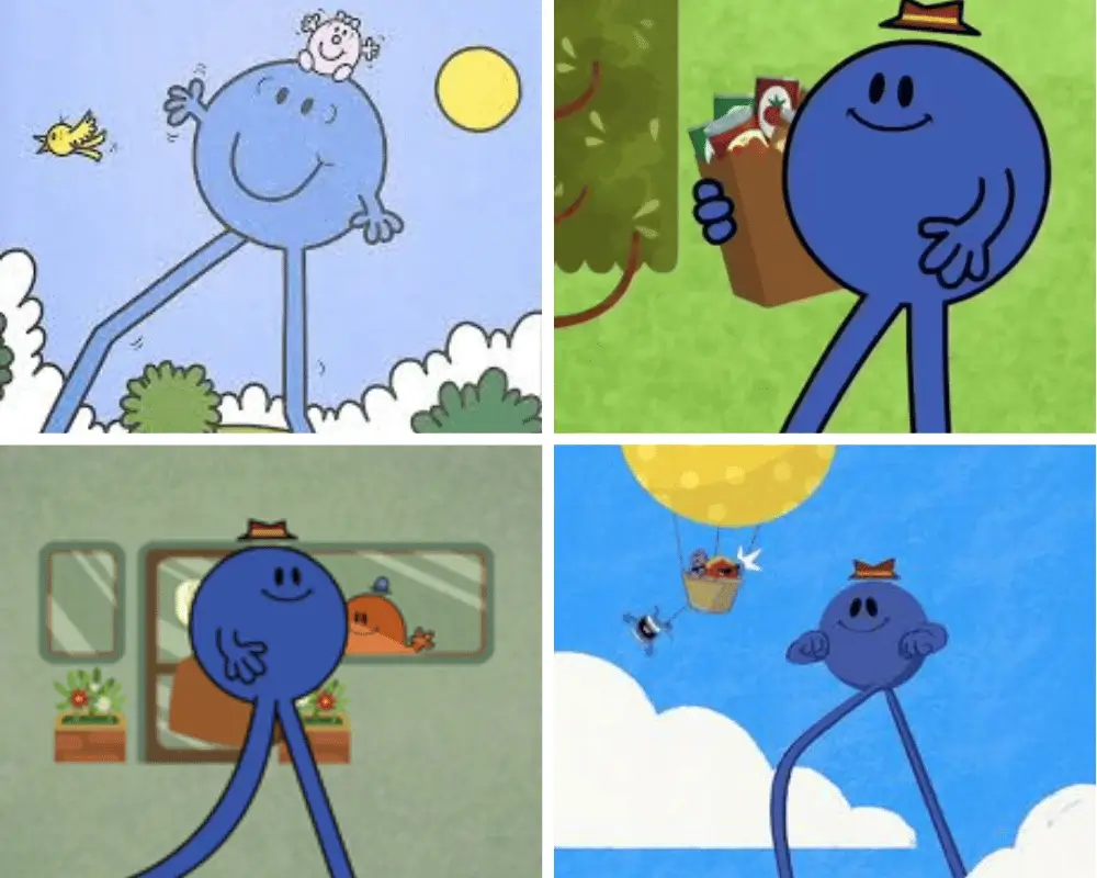
Archetype: The Frame-Breaking Minimalist
Mr. Tall proves that one exaggerated proportion can carry an entire character.
Roger Hargreaves gave him a small blue body and legs so long that normal environments become visual problems. The official Mr. Men profile describes him as the tallest Mr. Man and turns his oversized legs into practical advantages.
In animation, those legs create jokes automatically. He can step over obstacles, tower beyond the normal composition, and make an ordinary doorway look absurdly small.
- Visual signature: A tiny rounded body resting on two enormous stilt legs.
- Animation secret: His proportions force every environment to react to him.
- Why it matters: Remove the legs and there is no character concept left.
Pearl (Steven Universe)
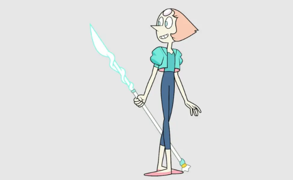
Archetype: The Precision Triangle
Pearl is built from long lines and pointed decisions.
Her narrow body, pointed nose, short wedge of hair, and spear all pull the eye in the same direction. Even her movements tend to be extended, balanced, and carefully placed, reflecting a character who wants order in a world that continually refuses to provide it.
What I like about Pearl’s design is that elegance and anxiety occupy the same silhouette. She can look like a disciplined dancer one moment and a tightly wound spring the next.
- Visual signature: A spear-like profile made from narrow curves and sharp points.
- Animation secret: Ballet-inspired lines can remain graceful or tighten into nervous control.
- Why it matters: Her design communicates discipline, fragility, and exactness simultaneously.
Marceline the Vampire Queen (Adventure Time)
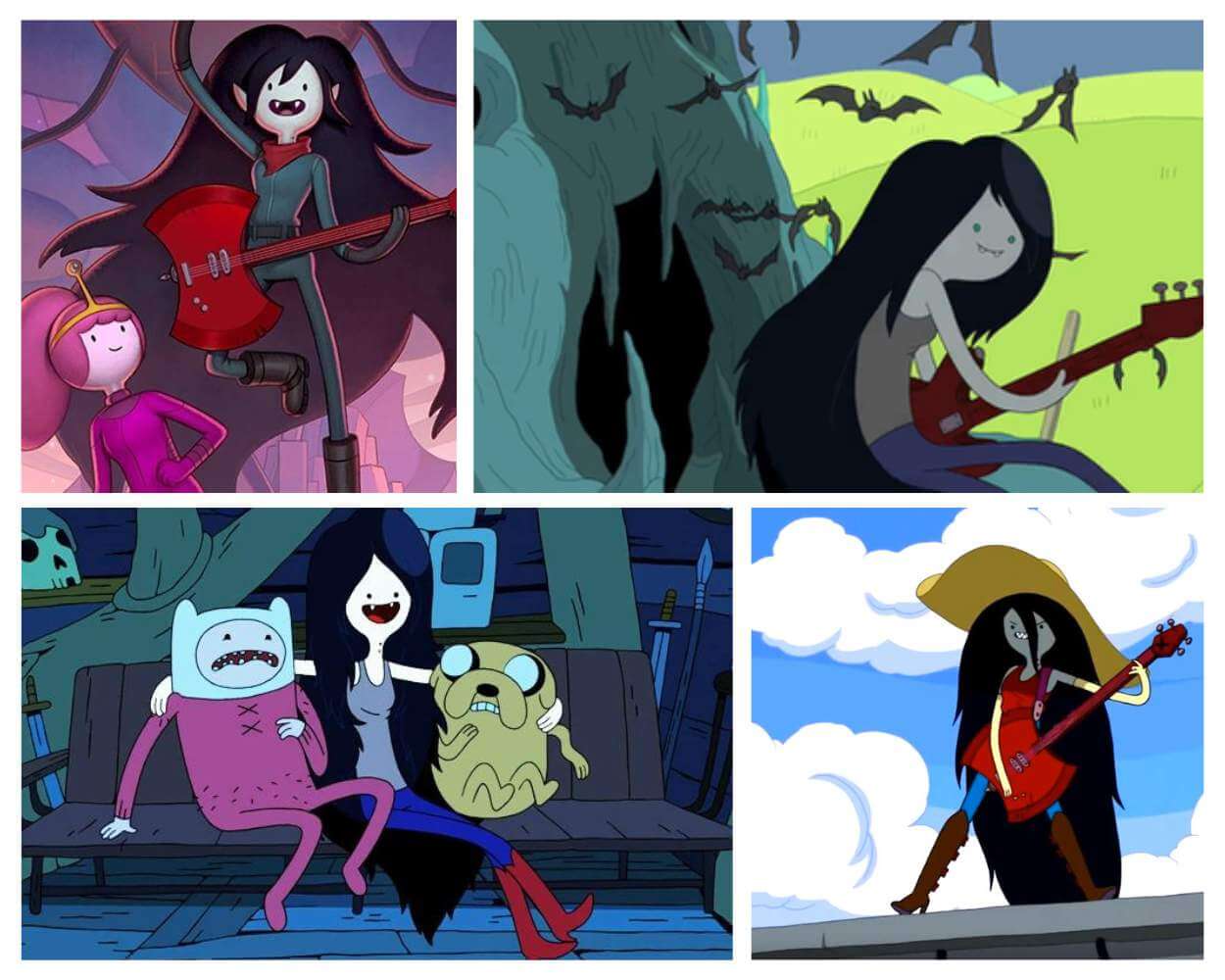
Archetype: The Floating Gothic Line
Marceline often seems less like she is walking through a scene than drifting across it.
Her long limbs, dark hair, narrow torso, and bass guitar create a relaxed rock-poster silhouette. In a world full of short, rounded, and candy-colored shapes, she cuts through the frame like a black brushstroke.
The thin design helps her look ancient and supernatural without making her stiff. She can stretch into monster forms, float upside down, or collapse into a casual musician’s slouch without losing the character.
- Visual signature: Long hair and limbs forming one loose, dark vertical shape.
- Animation secret: Floating removes weight from an already light silhouette.
- Why it matters: Marceline looks effortlessly cool because the design never appears to be trying too hard.
Candace Flynn (Phineas and Ferb)
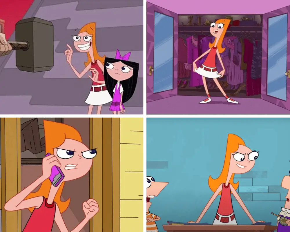
Archetype: The Vertical Panic Line
Candace’s body seems designed to make frustration travel.
Her long neck, narrow torso, thin arms, and enormous feet give every attempt to bust her brothers a clear line of action. When she points, recoils, runs, or screams for her mother, the motion travels from one end of the design to the other.
Phineas and Ferb is full of geometric bodies, but Candace is one of the best examples of proportion being used as performance. She can go from confident teenager to tangled panic in a single pose.
- Visual signature: Long neck, triangular head, narrow torso, and oversized feet.
- Animation secret: Her entire body can become one long exclamation mark.
- Why it matters: The stretched proportions make her escalating frustration readable from across the room.
Grim (The Grim Adventures of Billy & Mandy)
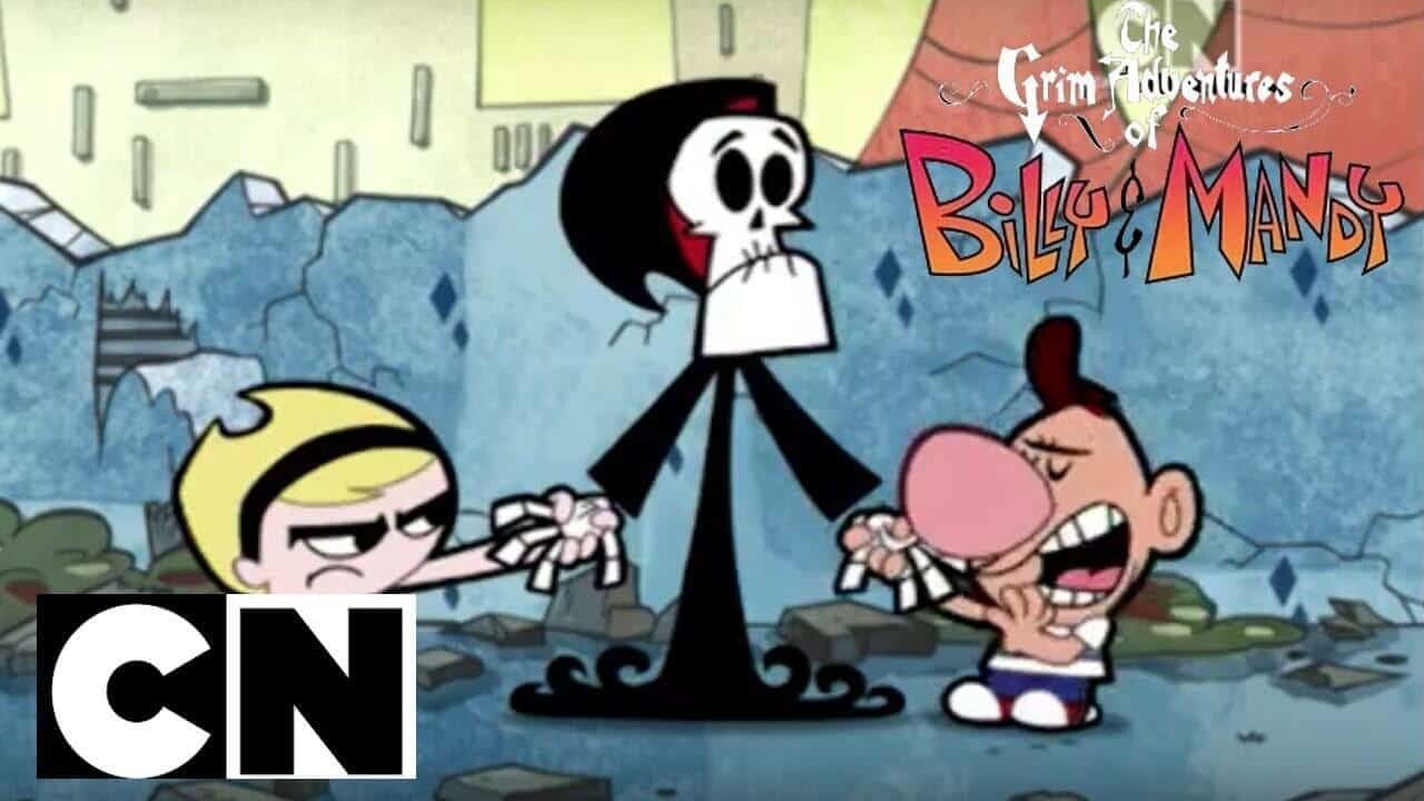
Archetype: The Deflated Lord of Death
Grim is literally a skeleton, but the comedy depends on more than exposed bones.
His tall robe and narrow skull give him the silhouette of a classic supernatural threat. Then Billy and Mandy drag that ancient symbol of death into chores, petty arguments, and humiliating domestic nonsense.
The design is ominous enough to make the contrast work. A cute or rounded Grim would not create the same joke.
- Visual signature: A skull and scythe floating inside one long black robe.
- Animation secret: Skeletal hands and shoulders make exasperated gestures unusually clear.
- Why it matters: His frightening outline gives ordinary humiliation a much stronger punchline.
Ichabod Crane (The Legend of Sleepy Hollow)
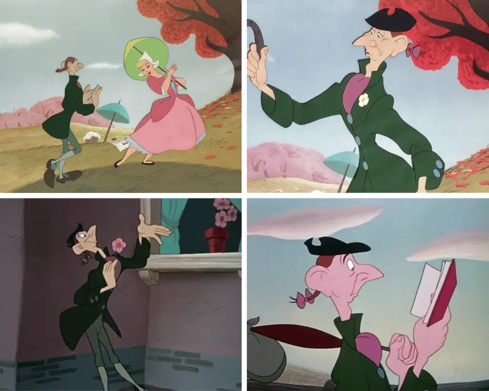
Archetype: The Frightened Yardstick
Disney’s Ichabod Crane is a landmark lanky character because nearly every feature pushes in the same direction.
He has long legs, narrow shoulders, large feet, a sharp nose, and a neck that seems to extend whenever fear takes hold. D23 describes him as the “gangly schoolmaster” and notes that Disney Legend Frank Thomas handled much of his animation.
The design becomes especially effective during the Headless Horseman chase. Ichabod’s limbs do not merely run; they scatter in several directions while the rest of him tries to keep up.
Disney’s archival history notes that his appearance was unlike anything the studio had previously put onscreen.
- Visual signature: Long nose, neck, legs, and oversized feet arranged like nervous punctuation.
- Animation secret: Fear can ripple through his entire body before it reaches his face.
- Why it matters: Ichabod looks superstitious, hungry, awkward, and easily frightened before the narration tells us any of it.
Mr. Burns (The Simpsons)
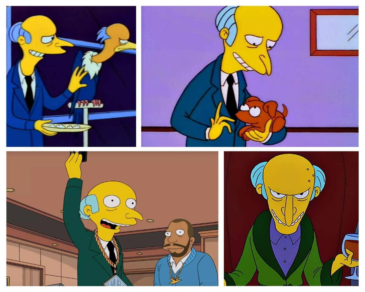
Archetype: The Frail Tyrant
Mr. Burns is a visual contradiction: enormous power inside almost no physical mass.
His hooked nose, hunched spine, narrow shoulders, and long claw-like fingers make him look ancient and breakable. Yet he controls the power plant, intimidates Springfield, and treats nearly everyone around him as disposable.
That mismatch is the joke and the threat. His body suggests weakness, while his money gives him power nobody can easily challenge.
- Visual signature: Skeletal hunch, pointed nose, and clasped claw hands.
- Animation secret: Tiny, fragile movements make sudden cruelty feel colder.
- Why it matters: The design proves social power and physical strength are not the same thing.
Wilt (Foster’s Home for Imaginary Friends)
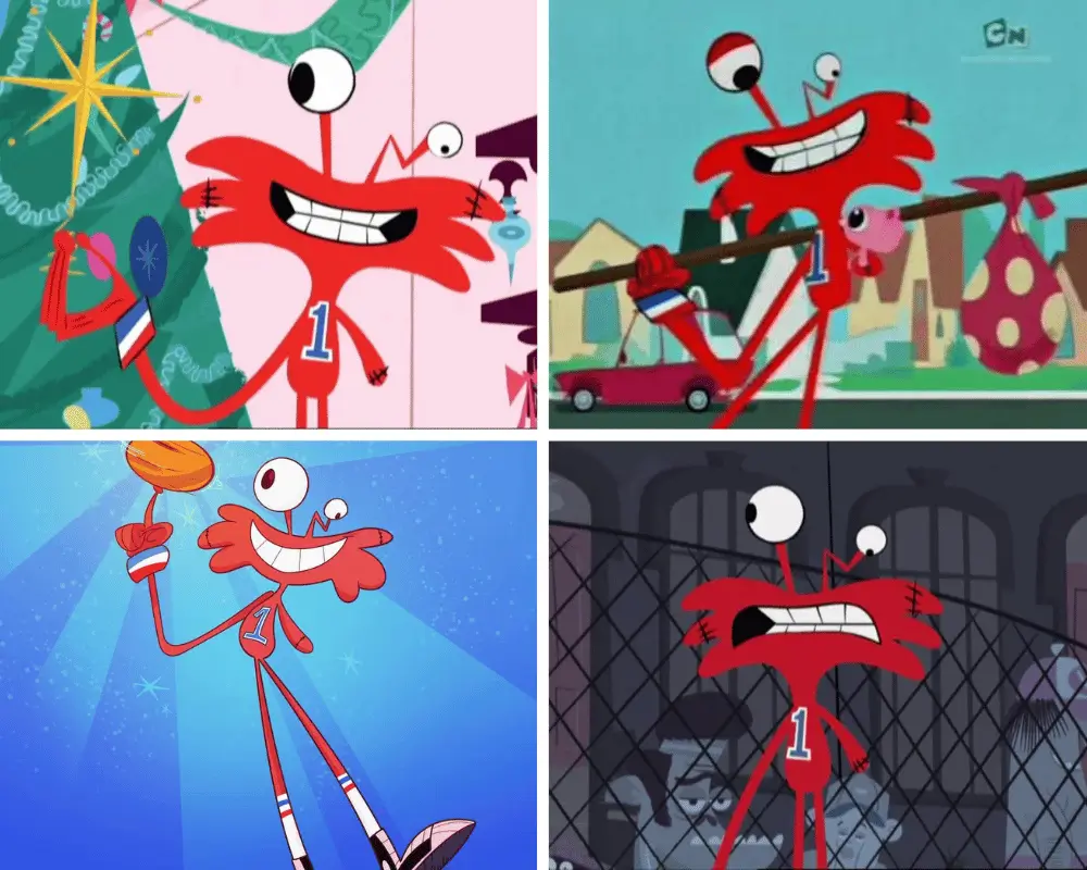
Archetype: The Gentle Giant Who Makes Himself Smaller
Wilt should dominate every room he enters.
He is extremely tall, bright red, and instantly noticeable. Instead, he bends, ducks, apologizes, and lowers himself toward everyone else’s eye line. His missing arm and damaged eye also give the silhouette an asymmetry tied directly to his history.
The design tells us something quietly painful: Wilt takes up a huge amount of physical space while constantly behaving as though he should take up less.
That is why he ranks so high for me. His proportions are not simply funny. They are emotional.
- Visual signature: Towering red frame, one arm, and a crooked eye.
- Animation secret: He can compress an enormous silhouette into small, apologetic poses.
- Why it matters: Wilt’s body visualizes a character who stretches himself too thin for everyone else.
Wile E. Coyote (Looney Tunes)
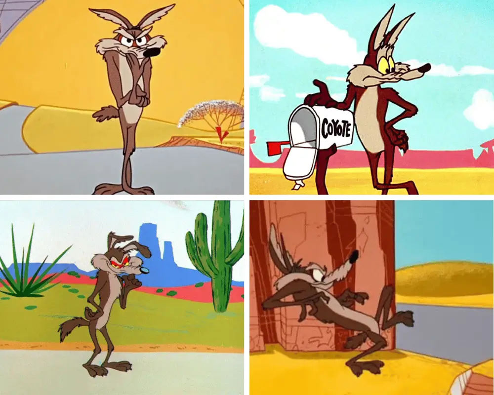
Archetype: The Starving Slapstick Machine
Wile E. Coyote looks permanently stretched by hunger, obsession, and gravity.
His narrow chest, long muzzle, thin legs, and rough fur make him look less like a healthy predator than a plan that has already failed. That gauntness is essential when he is flattened, folded, burned, dropped, and then forced to rebuild himself for another attempt.
The body is thin enough to become an accordion, a line in the distance, or a tiny shape at the bottom of a canyon.
For a later reinvention of the character, see my profile of Tech E. Coyote.
- Visual signature: Long muzzle, gaunt torso, and scraggly limbs.
- Animation secret: His shape can absorb impossible impacts while remaining recognizable.
- Why it matters: Wile E. looks hungry enough to attempt every terrible idea before he opens the ACME box.
Goofy (Disney)
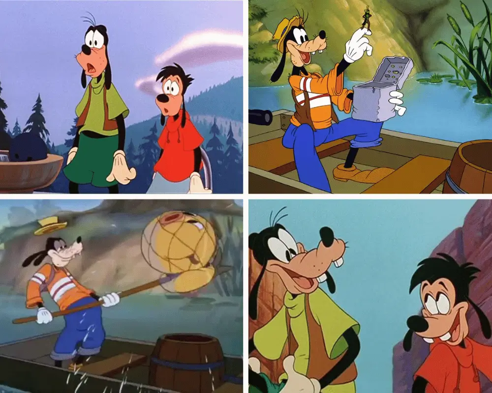
Archetype: The Friendly Rubber-Hose Giant
Goofy is the rare character whose entire body seems to lose an argument with momentum.
His long arms and legs do not react at the same speed. A foot catches, the torso continues, the arms attempt a rescue, and the head arrives last with a confused “gawrsh.”
That staggered movement makes his clumsiness feel warm rather than painful. Goofy is never just falling; he is sincerely trying to correct the fall while creating three new problems.
- Visual signature: Long muzzle, tall hat, narrow torso, and loose dangling limbs.
- Animation secret: Different parts of his body can appear to move on separate schedules.
- Why it matters: The flexible frame turns incompetence into an endearing performance rather than a cruel joke.
The Pink Panther
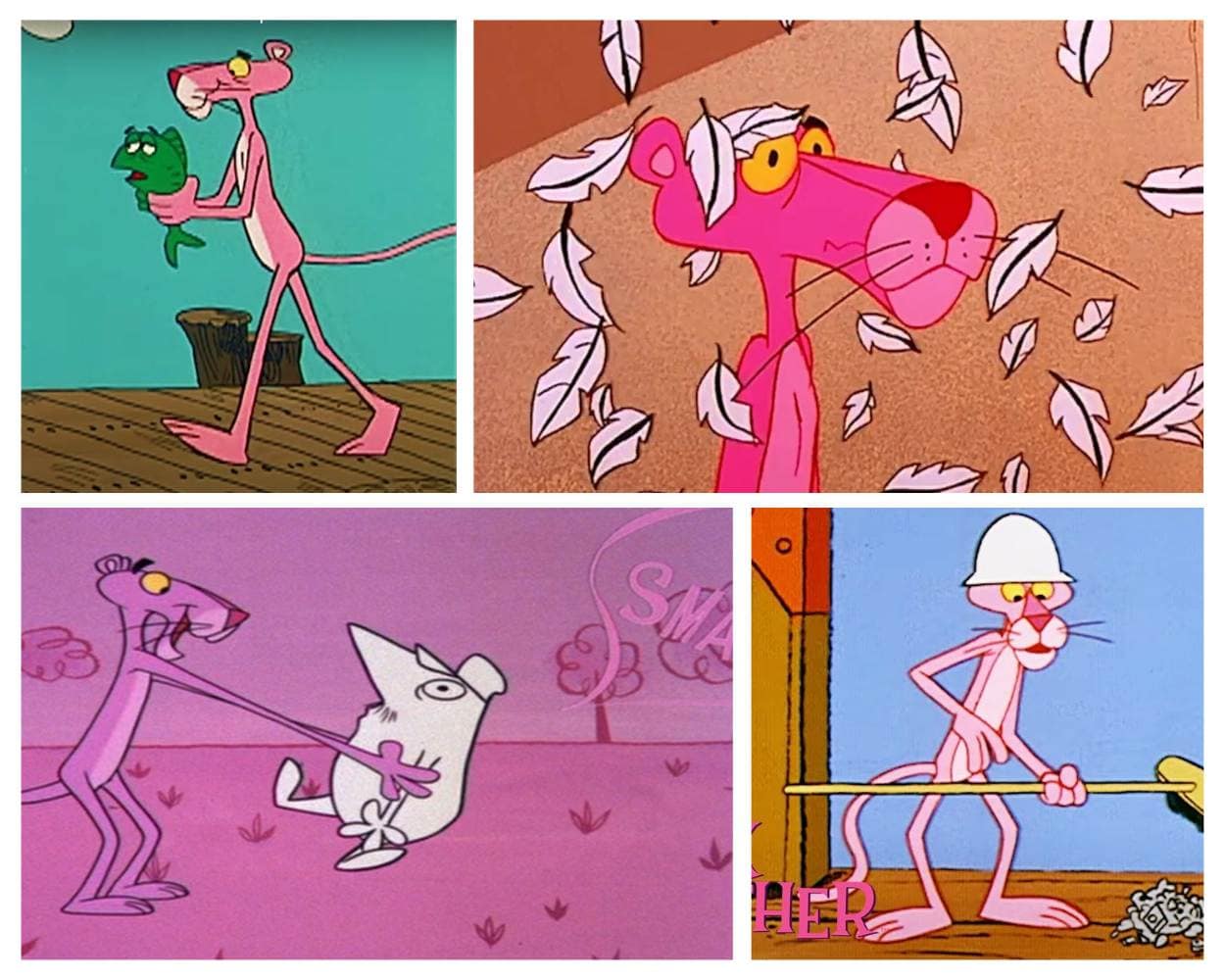
Archetype: The Elegant Single Line
The Pink Panther is proof that a skinny design does not have to look nervous or weak.
His long limbs, narrow chest, tiny waist, and smooth tail create a silhouette built for controlled movement. A walk becomes a performance. A pause becomes a joke. A slight turn of the wrist can carry more attitude than another character’s entire speech.
The official MGM franchise page reflects how far the character outgrew his original title-sequence role.
What makes the design timeless is the economy. There is almost nothing to remove.
- Visual signature: One long pink curve from nose to tail.
- Animation secret: Small gestures remain legible because the silhouette is so clean.
- Why it matters: His thinness turns silence into elegance instead of emptiness.
Shaggy Rogers (Scooby-Doo)
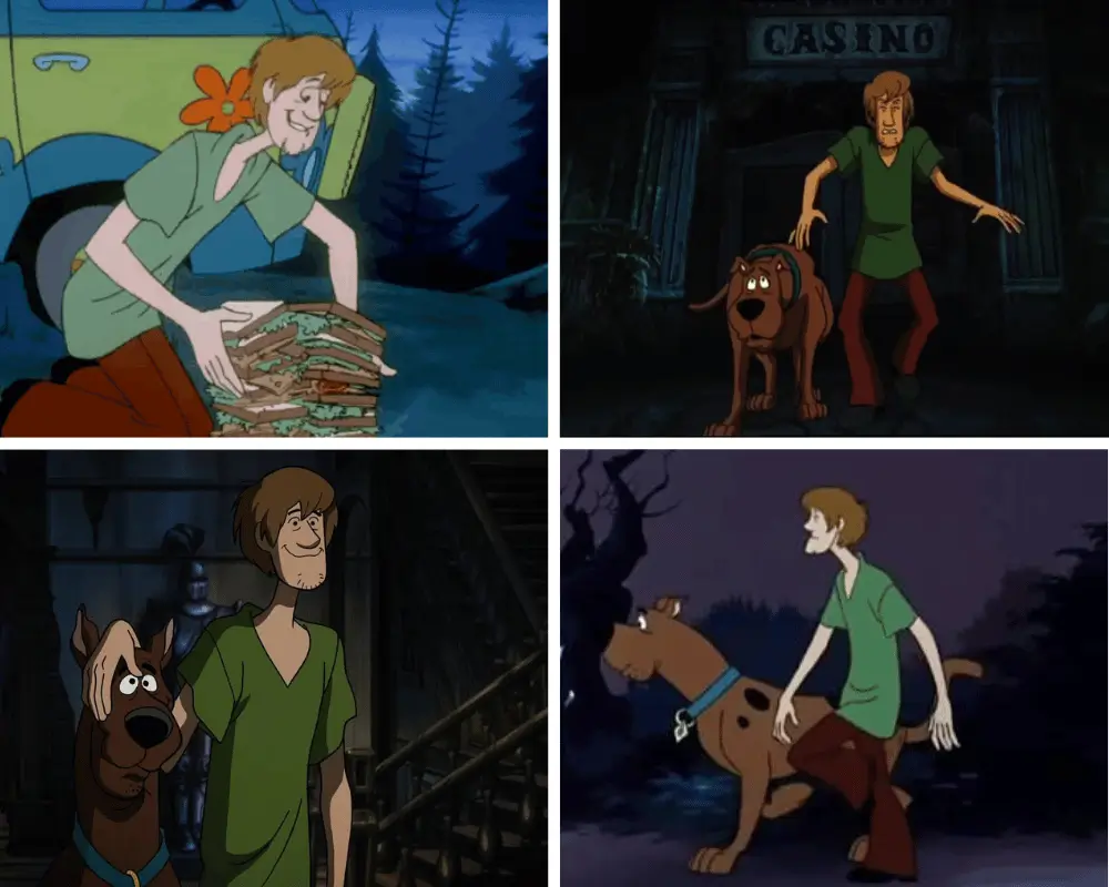
Archetype: The Bottomless Beanpole
Shaggy is one of animation’s most recognizable tall and skinny cartoon characters because the design supports two jokes at once.
First, he is terrified of nearly everything. His bent knees, slumped shoulders, loose shirt, and long limbs make him look ready to flee before a monster appears.
Second, he eats enormous amounts of food without ever gaining visible mass. The appetite-to-frame contradiction has powered jokes for generations.
His panic run also depends on the body. Shaggy’s legs cycle, arms scatter, jaw drops, and the whole silhouette seems to stretch away from danger.
- Visual signature: Scruffy chin, loose green shirt, brown pants, and permanent slouch.
- Animation secret: Long limbs make his panic runs and double-takes feel explosive.
- Why it matters: Shaggy looks hungry and frightened before either joke begins.
Olive Oyl (Popeye)
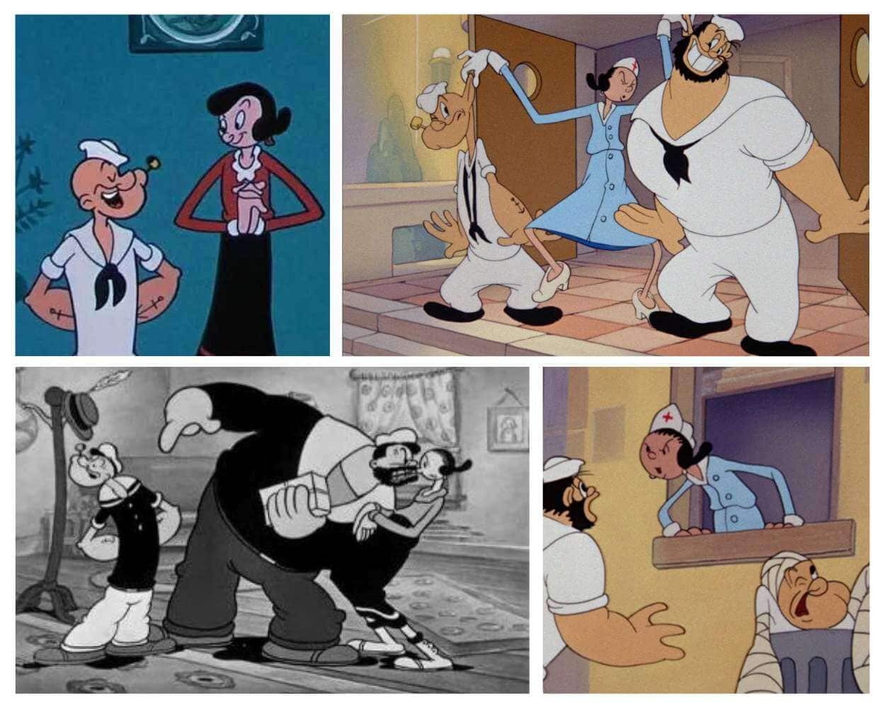
Archetype: The Original Noodle-Limb Star
Olive Oyl was lanky before Popeye even entered her world.
- King Features records that Olive debuted in Thimble Theatre in 1919, ten years before Popeye appeared in the strip. Her narrow body, huge shoes, bun, and endlessly bendable arms became even more expressive in animation.
Olive’s thinness is not only a beauty contrast with Popeye’s compact strength and Bluto’s bulk. It gives her a comic motion language entirely her own. She can tangle, flap, kick, swing, and fold without losing the silhouette.
- Visual signature: Tiny torso, noodle limbs, bun, and oversized feet.
- Animation secret: Her body can knot and unknot like a ribbon.
- Why it matters: Olive helped establish the visual language later lanky cartoon characters inherited.
Jack Skellington (The Nightmare Before Christmas)
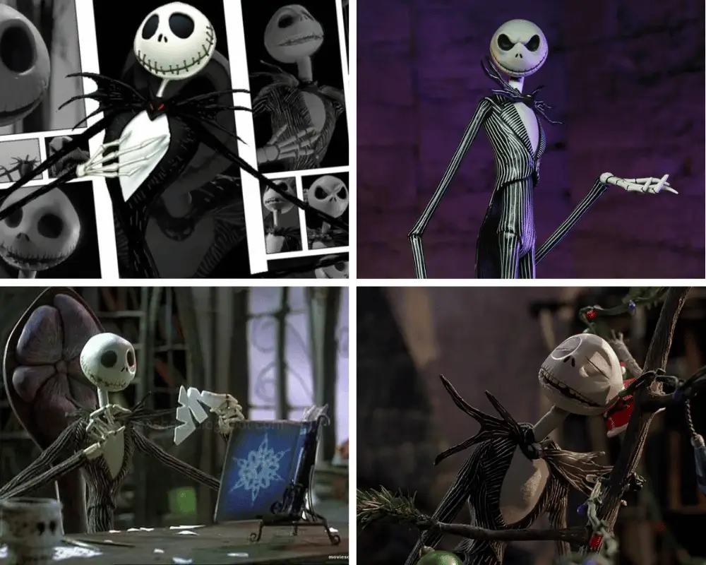
Archetype: The Gothic Silhouette Perfected
Jack Skellington is the obvious number one because his thinness controls nearly everything we understand about him.
- Tim Burton’s skeletal design and Henry Selick’s stop-motion direction turn Jack into a moving collection of elegant angles. His legs seem endless, his pinstripes extend the vertical shape, and his bat bow tie provides a sharp focal point beneath the round skull.
Jack can tower over Halloween Town, fold himself into melancholy, or sweep across a musical number like a theatrical conductor. The proportions make him frightening, graceful, romantic, and slightly ridiculous without changing the model.
Disney’s official page describes The Nightmare Before Christmas as the story of Halloween Town’s Pumpkin King becoming obsessed with Christmas. Jack’s design makes that role instantly believable: he looks like a king, a ghost, and a showman in one outline.
- Visual signature: Round skull, bat bow tie, pinstripes, and spider-long limbs.
- Animation secret: His extreme height gives every musical pose and emotional collapse a dramatic arc.
- Why it matters: With ordinary proportions, Jack would be a man in a skeleton costume. The impossible frame makes him otherworldly.
Skinny Cartoon Characters by Design Type
| Design type | What it communicates | Best examples |
|---|---|---|
| Slapstick noodle | Flexibility, chaos, and exaggerated falls | Goofy, Olive Oyl, Wile E. Coyote |
| Gothic string-bean | Elegance, mystery, and supernatural distance | Jack Skellington, Marceline, Stolas |
| Neurotic beanpole | Anxiety, obsession, and physical instability | Mr. Crocker, Mandark, Rick Sanchez |
| Fashion line | Grace, style, and visual lightness | Judy Jetson, Leni Loud, Pearl |
| Frail authority figure | Power that does not come from the body | Mr. Burns, Rick Sanchez, Grim |
Why the Best Lanky Cartoon Designs Last
The best skinny cartoon characters are not memorable because thinness is automatically funny, attractive, or strange.
They last because artists turn proportion into performance.
Jack Skellington’s limbs make him theatrical. Olive Oyl’s arms make her elastic. Shaggy’s frame makes fear and hunger coexist in one joke. Wilt’s height becomes a story about kindness and self-erasure. Mr. Burns turns physical frailty into a contrast with institutional power.
That is the real design lesson.
A body shape becomes valuable when it tells us something the dialogue does not need to explain.
The repeated visual cues that make a silhouette recognizable also connect to the broader question of how cartoons shape children and teach viewers to read personality through color, posture, and shape.
Building a larger character-design collection?
These entries pair naturally with my guides to bald cartoon characters, cartoon characters with spiked hair, and characters with dreadlocks.
Animators always say a legendary character design is recognizable instantly just by their silhouette, and lanky characters really prove that point! From Olive Oyl’s noodle-limb flexibility to Jack Skellington’s spindly frame, extreme proportions make visual comedy so much funnier.
Hey everyone! I felt it was long overdue to give this post a major refresh. Originally written back in 2023, the old version was pretty basic and just focused on physical looks. Looking back, I realized there’s so much more to say about these designs!
I’ve updated the style to focus on character design theory and animation archetypes breaking down why these iconic skinny frames work, how animators use extreme proportions for comedy or drama, and what makes their silhouettes so legendary. Hope you enjoy the upgraded breakdown!
Jack Skellington’s silhouette is pure stop-motion perfection! Jack’s suit was originally supposed to be solid black, but his frame was so spindly that he kept completely disappearing into the dark backgrounds on set. Director Henry Selick added those thin white pinstripes specifically so animators could actually see his skinny limbs moving frame-by-frame!
What’s wild about Jack Skellington’s spindly design is how much life they gave a literal skeleton. You are also right in your other comment about the silhouette and being instantly recognizable.
Shaggy Rogers from Scooby-Doo is the ultimate classic gangly character! i guess I wold too if I was running from ghosts every day!
Exaggerated thin character designs always lead to the best visual gags. There’s nothing quite like the classic cartoon trope of a character folding into a pretzel or folding up like an accordion for instant comedic effect.